



"What's the point of maths?" "Maths is too abstract!" "What's a function?" Teachers often hear questions like these… and they are perfectly valid! Highlighting the connections between what students study in high school and the world around them can help them understand mathematics better. The Graph 90+E calculator features a menu called Plot Image, designed to help students make these connections.
Understanding a trajectory
-------------------------------
The Plot Image menu allows users to place points on an image, highlighting curves and geometric shapes so that they can be studied. It can also be used with animated images or films. To do this, the film sequence under study is divided into as many frames as there are points to plot. Each time a point is plotted, the display advances to the next frame. This lets us track an object's trajectory, among other things.
Consider the famous globe scene from Charlie Chaplin's satirical film The Great Dictator (Charles Chaplin Productions, 1940), a cinema classic if ever there was one. The scene has been analysed many times, but here we take a very different look at it, studying the globe's trajectory as the dictator plays with it. The scene has already been divided into ten frames, which can then be transferred to the calculator using a simple USB cable. You can download this file and find more information about the activity on casio-education.fr, under "Teaching". The resource is titled "Charlie Chaplin's polynomial" and is available as a free download.
Choosing a coordinate system
-----------------------
To model the globe's trajectory, plot a point at each of its positions. Start by examining the different frames:
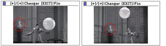
We can see that the cameraman changes the framing: in the first frame, the statue is at the far left, but in the second it is not quite in the same place. To overcome this problem, we need to position the origin of the coordinate system at the centre of the statue's head in every frame.
Plotting the points
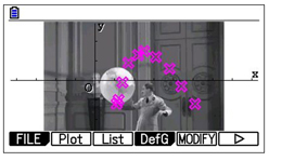
We plot the points corresponding to the globe's position in each frame. For greater accuracy, we consistently use the globe's South Pole. This gives the image below.
Quadratic polynomial interpolation
-------------------------------------------------
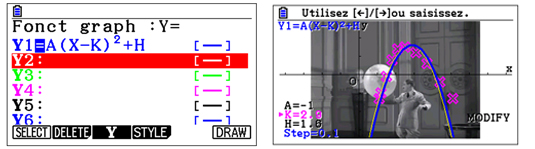
The trajectory looks like a parabola. Plot the graph of the polynomial P(x) = a(x – k)2 + h and adjust the parameters a, k and h so that the parabola passes "as close as possible" to the points. This shows the relationship between the parameters in the vertex form of a quadratic polynomial, the coordinates of the parabola's vertex and the function's behaviour. For example, choosing parameter values of 1, 2.9 and 1.6 respectively gives P(x) = –(x – 2.9)2 + 1.6, or equivalently P(x) = –x2 + 5.8 x – 6.81. This choice produces the figure below, with the parabola shown in blue, but the fit is not very satisfactory.
Regression
----------
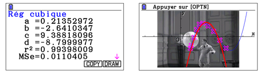
Now check our result using the calculator's quadratic regression. The "manual" approximation was not accurate enough, but even the calculator's quadratic regression does not produce a very satisfactory fit. Now construct a cubic regression, shown in blue in the screenshot below.
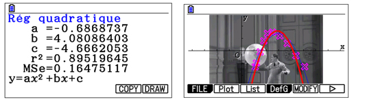
This curve gives a much better fit. It can also provide a good introduction to regression, showing experimentally that the higher the degree of the polynomial, the more accurate the approximation. We could just as easily test other types of regression: there is plenty of scope for experimentation…