



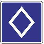
The latest official sign to be added to the French Highway Code bans vehicles carrying fewer than two passengers from using certain lanes. White on a blue background, it stands out for its diamond shape. Could this diamond shape be intended to win over "solo drivers" who might be tempted to use the lane? In any case, the design is harmonious and is sure to attract attention, even if it does not ensure that the ban is observed.
Carmakers under the spell of the rhombus
-------------------------------------------------------
Mention the "rhombus" and one immediately thinks of the French carmaker whose iconic logo is this shape: Renault.
In 1899, when the two brothers Louis and Marcel founded Renault Frères, the original logo was simply two symmetrical, intertwined "R"s. In 1923, the name "Renault" appeared explicitly on the hoods, within a round, striped open grille that allowed the sound of the horn to pass through. In 1925, to suit the angular shape of the hoods, this image was replaced by a rhombus, also striped.
In the 1970s, a desire for modernity emerged, and designer Michel Boué proposed two joined half-rhombuses. But the design was deemed "too close" to the logo of Kent, an automotive supplier, and had to be abandoned after a year, following a lawsuit lost by the diamond-badged company.
Working against the clock in 1972, Victor Vasarely, assisted by his son Jean-Pierre Vasarely, known as Yvaral, created a logo familiar to everyone, inspired by the artist's optical illusions. It consisted of several interlocking rhombuses that created the illusion of an impossible three-dimensional object. This logo represented Renault until 1992, when it was replaced by a reworked version of Vasarely's image: the sides of the rhombuses gave way to a solid structure that retained the same movement, with shadow effects.
After various simplifications—in 2015, for example—the process culminated in today's minimalist design in 2021, a streamlined version of the logo devised by Vasarely and his son Yvaral. The history of all these logos can be found on the brand's website.
Other carmakers have adopted the rhombus in their branding, including the Japanese company Mitsubishi Motors Corporation, which uses three rhombuses meeting at their vertices. The design was almost inevitable: the Japanese word "Mitsubishi" means "three diamonds".